Which of the following is the best rule to follow for ordering the pieces of the pie in a pie chart?
Table of contents
- 1. Intro to Stats and Collecting Data1h 14m
- 2. Describing Data with Tables and Graphs1h 55m
- 3. Describing Data Numerically2h 5m
- 4. Probability2h 16m
- 5. Binomial Distribution & Discrete Random Variables3h 6m
- 6. Normal Distribution and Continuous Random Variables2h 11m
- 7. Sampling Distributions & Confidence Intervals: Mean3h 23m
- Sampling Distribution of the Sample Mean and Central Limit Theorem19m
- Distribution of Sample Mean - Excel23m
- Introduction to Confidence Intervals15m
- Confidence Intervals for Population Mean1h 18m
- Determining the Minimum Sample Size Required12m
- Finding Probabilities and T Critical Values - Excel28m
- Confidence Intervals for Population Means - Excel25m
- 8. Sampling Distributions & Confidence Intervals: Proportion1h 25m
- 9. Hypothesis Testing for One Sample3h 29m
- 10. Hypothesis Testing for Two Samples4h 50m
- Two Proportions1h 13m
- Two Proportions Hypothesis Test - Excel28m
- Two Means - Unknown, Unequal Variance1h 3m
- Two Means - Unknown Variances Hypothesis Test - Excel12m
- Two Means - Unknown, Equal Variance15m
- Two Means - Unknown, Equal Variances Hypothesis Test - Excel9m
- Two Means - Known Variance12m
- Two Means - Sigma Known Hypothesis Test - Excel21m
- Two Means - Matched Pairs (Dependent Samples)42m
- Matched Pairs Hypothesis Test - Excel12m
- 11. Correlation1h 24m
- 12. Regression1h 50m
- 13. Chi-Square Tests & Goodness of Fit2h 21m
- 14. ANOVA1h 57m
2. Describing Data with Tables and Graphs
Pie Charts
Problem 2.1.26a
Textbook Question
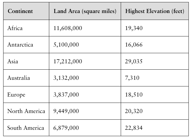
"Highest Elevation The following data represent the land area and highest elevation for each of the seven continents.

a. Would it make sense to draw a pie chart for land area? Why? If so, draw a pie chart."
Verified step by step guidance1
Step 1: Understand the data provided. The table lists the land area (in square miles) and highest elevation (in feet) for each of the seven continents. For a pie chart, we focus on the land area values because pie charts represent parts of a whole.
Step 2: Determine if a pie chart is appropriate. Since the land area values represent parts of the total land area of all continents combined, a pie chart is suitable to show the proportion each continent contributes to the total land area.
Step 3: Calculate the total land area by summing the land areas of all continents: \(\text{Total Land Area} = 11,608,000 + 5,100,000 + 17,212,000 + 3,132,000 + 3,837,000 + 9,449,000 + 6,879,000\).
Step 4: Calculate the proportion (or percentage) of each continent's land area relative to the total land area. For each continent, use the formula: \(\text{Proportion} = \frac{\text{Continent Land Area}}{\text{Total Land Area}}\).
Step 5: Use these proportions to draw the pie chart. Each slice of the pie chart corresponds to a continent, and the size of each slice is proportional to its land area percentage. Label each slice with the continent name and its percentage.
Verified video answer for a similar problem:This video solution was recommended by our tutors as helpful for the problem above
Video duration:
3mPlay a video:
Was this helpful?
Key Concepts
Here are the essential concepts you must grasp in order to answer the question correctly.
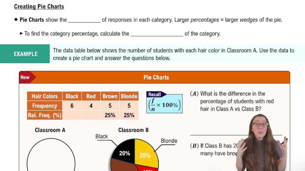
Pie Chart
A pie chart is a circular graph divided into slices to illustrate numerical proportions. It is best used to represent parts of a whole, where each slice corresponds to a category's contribution to the total. For example, showing the proportion of land area each continent occupies relative to the total land area.
Recommended video:
Creating Pie Charts
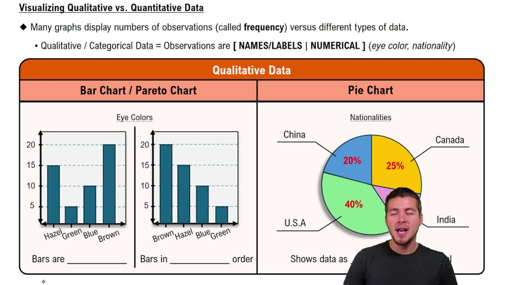
Categorical vs. Quantitative Data
Categorical data represent distinct groups or categories, such as continents, while quantitative data are numerical values, like land area or elevation. Pie charts are suitable for categorical data with quantitative measures that sum to a whole, making land area by continent an appropriate use.
Recommended video:
Guided course
Visualizing Qualitative vs. Quantitative Data
Data Suitability for Visualization
Choosing the right graph depends on the data's nature and the message to convey. Since land area values are parts of a total land surface, a pie chart effectively shows relative sizes. However, highest elevation values are individual measurements and do not sum to a whole, so a pie chart would not be appropriate for them.
Recommended video:
Guided course
Visualizing Qualitative vs. Quantitative Data
Related Videos
Related Practice
Multiple Choice
13
views