Textbook Question
Environment
a. After collecting the average (mean) global temperatures for each of the most recent 100 years, we want to construct the graph that is most appropriate for these data. Which graph is best?
60
views

 Verified step by step guidanceVerified video answer for a similar problem:
 04:01
04:01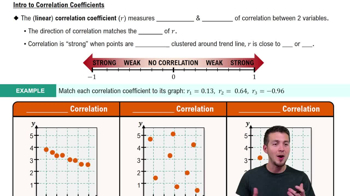 05:43
05:43 05:53
05:53 4:39m
4:39mMaster Visualizing Qualitative vs. Quantitative Data with a bite sized video explanation from Patrick
Start learning