Crime Rate and Cell Phones The linear correlation between violent crime rate and percentage of the population that has a cell phone is −0.918 for years since 1995. Do you believe that increasing the percentage of the population that has a cell phone will decrease the violent crime rate? What might be a lurking variable between percentage of the population with a cell phone and violent crime rate?
Table of contents
- 1. Intro to Stats and Collecting Data1h 14m
- 2. Describing Data with Tables and Graphs1h 56m
- 3. Describing Data Numerically2h 0m
- 4. Probability2h 17m
- 5. Binomial Distribution & Discrete Random Variables3h 6m
- 6. Normal Distribution and Continuous Random Variables2h 11m
- 7. Sampling Distributions & Confidence Intervals: Mean3h 23m
- Sampling Distribution of the Sample Mean and Central Limit Theorem19m
- Distribution of Sample Mean - ExcelBonus23m
- Introduction to Confidence Intervals15m
- Confidence Intervals for Population Mean1h 18m
- Determining the Minimum Sample Size Required12m
- Finding Probabilities and T Critical Values - ExcelBonus28m
- Confidence Intervals for Population Means - ExcelBonus25m
- 8. Sampling Distributions & Confidence Intervals: Proportion2h 10m
- 9. Hypothesis Testing for One Sample5h 8m
- Steps in Hypothesis Testing1h 6m
- Performing Hypothesis Tests: Means1h 4m
- Hypothesis Testing: Means - ExcelBonus42m
- Performing Hypothesis Tests: Proportions37m
- Hypothesis Testing: Proportions - ExcelBonus27m
- Performing Hypothesis Tests: Variance12m
- Critical Values and Rejection Regions28m
- Link Between Confidence Intervals and Hypothesis Testing12m
- Type I & Type II Errors16m
- 10. Hypothesis Testing for Two Samples5h 37m
- Two Proportions1h 13m
- Two Proportions Hypothesis Test - ExcelBonus28m
- Two Means - Unknown, Unequal Variance1h 3m
- Two Means - Unknown Variances Hypothesis Test - ExcelBonus12m
- Two Means - Unknown, Equal Variance15m
- Two Means - Unknown, Equal Variances Hypothesis Test - ExcelBonus9m
- Two Means - Known Variance12m
- Two Means - Sigma Known Hypothesis Test - ExcelBonus21m
- Two Means - Matched Pairs (Dependent Samples)42m
- Matched Pairs Hypothesis Test - ExcelBonus12m
- Two Variances and F Distribution29m
- Two Variances - Graphing CalculatorBonus16m
- 11. Correlation1h 24m
- 12. Regression3h 33m
- Linear Regression & Least Squares Method26m
- Residuals12m
- Coefficient of Determination12m
- Regression Line Equation and Coefficient of Determination - ExcelBonus8m
- Finding Residuals and Creating Residual Plots - ExcelBonus11m
- Inferences for Slope31m
- Enabling Data Analysis ToolpakBonus1m
- Regression Readout of the Data Analysis Toolpak - ExcelBonus21m
- Prediction Intervals13m
- Prediction Intervals - ExcelBonus19m
- Multiple Regression - ExcelBonus29m
- Quadratic Regression15m
- Quadratic Regression - ExcelBonus10m
- 13. Chi-Square Tests & Goodness of Fit2h 21m
- 14. ANOVA2h 29m
11. Correlation
Scatterplots & Intro to Correlation
Problem 12.3.24
Textbook Question
Why is it important to perform graphical as well as analytical analyses when analyzing relations between two quantitative variables?
 Verified step by step guidance
1
Step 1: Understand that graphical analysis involves visualizing data using plots such as scatterplots, which help to identify patterns, trends, clusters, or outliers between two quantitative variables.
Step 2: Recognize that analytical analysis involves calculating numerical measures like correlation coefficients or fitting regression models to quantify the strength and nature of the relationship between the variables.
Step 3: Note that graphical analysis can reveal non-linear relationships, heteroscedasticity (changing variability), or unusual data points that might not be obvious from numerical summaries alone.
Step 4: Understand that analytical methods provide precise, objective measures and allow hypothesis testing, but they can sometimes be misleading if assumptions are violated or if the data contain anomalies.
Step 5: Conclude that combining both graphical and analytical analyses provides a more complete understanding of the relationship, ensuring that insights are both visually intuitive and statistically valid.
 Verified video answer for a similar problem:
This video solution was recommended by our tutors as helpful for the problem above
Video duration:
3mPlay a video:
0 Comments
Key Concepts
Here are the essential concepts you must grasp in order to answer the question correctly.
Graphical Analysis
Graphical analysis involves visualizing data using plots like scatterplots to identify patterns, trends, or outliers. It helps in understanding the relationship between two quantitative variables intuitively and can reveal non-linear associations or anomalies that numerical summaries might miss.
Recommended video:
Guided course

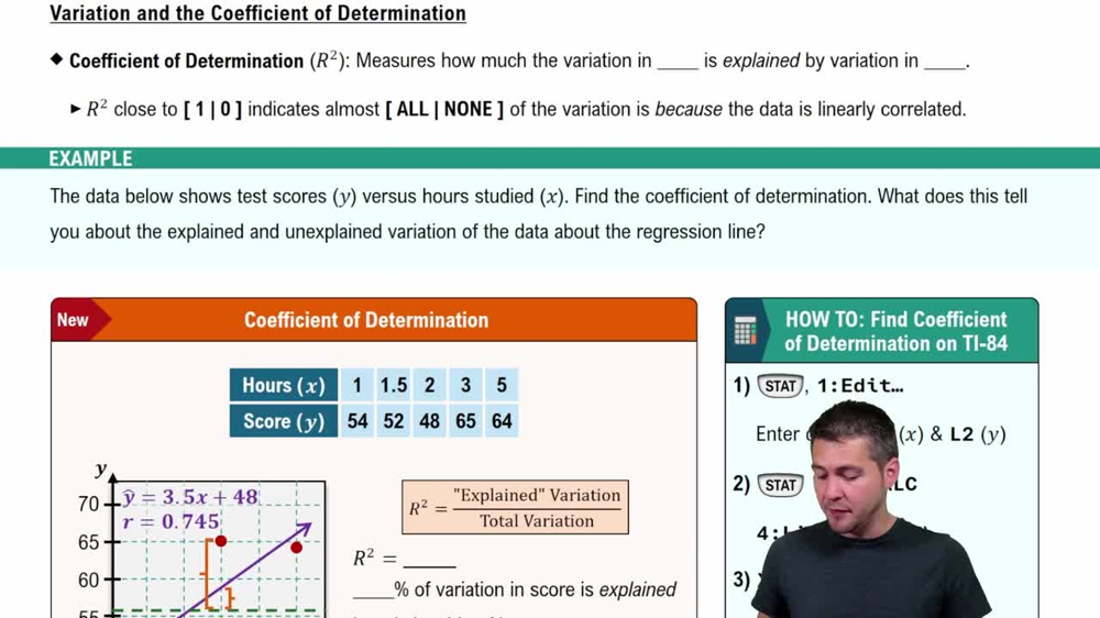
Coefficient of Determination
Analytical Analysis
Analytical analysis uses statistical methods such as correlation coefficients and regression models to quantify the strength and nature of the relationship between variables. This approach provides precise numerical measures and tests for significance, enabling objective conclusions about the data.
Recommended video:

Introduction to ANOVA
Complementarity of Graphical and Analytical Methods
Combining graphical and analytical analyses ensures a comprehensive understanding of data. Graphs offer a visual check for assumptions and data quality, while analytical methods provide formal evidence. Together, they reduce misinterpretation and improve the reliability of conclusions about variable relationships.
Recommended video:

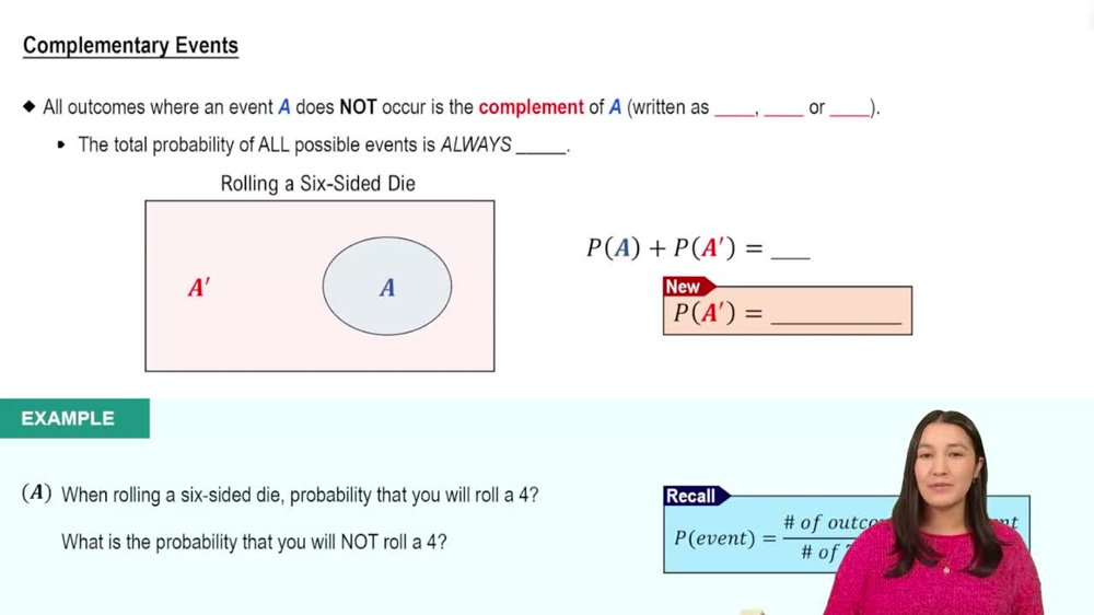
Complementary Events
Related Videos
Related Practice
Textbook Question
50
views


