Graphical Analysis In Exercises 13–16, give three observations that can be made from the graph.
Verified step by step guidance
1
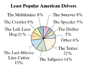
Observe the pie chart and note the percentages associated with each category of least popular American drivers. This will help identify which categories are most and least significant.
Identify the category with the highest percentage, which is 'The Texter' at 22%. This indicates that texting while driving is considered the least popular behavior among American drivers.
Identify the category with the second highest percentage, which is 'The Tailgater' at 14%. This suggests that tailgating is another major concern for drivers.
Compare the smaller percentages, such as 'The Speeder' and 'The Drifter,' both at 5%. These behaviors are less significant compared to others in terms of unpopularity.
Note that the 'Other' category accounts for 6%, which implies there are additional behaviors not specifically listed that contribute to the overall unpopularity of certain driving habits.
Verified video answer for a similar problem:
This video solution was recommended by our tutors as helpful for the problem above
Video duration:
7m
Play a video:
0 Comments
Key Concepts
Here are the essential concepts you must grasp in order to answer the question correctly.
Pie Chart Interpretation
A pie chart is a circular statistical graphic divided into slices to illustrate numerical proportions. Each slice represents a category's contribution to the total, making it easy to compare relative sizes. In this context, the pie chart displays the least popular American drivers, with each segment showing the percentage of respondents identifying each type of driver.
Percentages are a way to express a number as a fraction of 100, providing a clear understanding of proportions. In the graph, each driver type is represented by a percentage, indicating how many respondents view them as the least popular. This allows for quick comparisons between different categories, highlighting which driver types are perceived most negatively.
Data analysis involves examining, cleaning, and interpreting data to extract meaningful insights. In the context of the pie chart, making observations requires identifying trends, such as which driver types are most and least popular. Observations can include noting the highest percentage (The Textter at 22%) and comparing it to others, which helps in understanding public perceptions of driving behaviors.

 Verified step by step guidance
 06:10
06:10