Threaded Problem: Tornado The data set “Tornadoes_2017” located at www.pearsonhighered.com/sullivanstats contains a variety of variables that were measured for all tornadoes in the United States in 2017. a. Draw a relative histogram of the variable “Length.” Describe the shape of the distribution.
Verified step by step guidance
1
First, access the data set “Tornadoes_2017” from the provided source and locate the variable named “Length,” which represents the length of each tornado path.
Next, organize the data for the variable “Length” by determining an appropriate number of bins (intervals) to group the data. This can be done using rules like Sturges' formula or the square root choice to decide the number of bins.
Calculate the frequency of tornado lengths falling into each bin, then convert these frequencies into relative frequencies by dividing each bin's frequency by the total number of tornadoes. This will give the proportion of tornadoes in each length interval.
Using the relative frequencies, construct a histogram where the x-axis represents the bins of tornado lengths and the y-axis represents the relative frequency (proportion) for each bin. Ensure the bars are adjacent to reflect the continuous nature of the data.
Finally, analyze the shape of the histogram by observing characteristics such as symmetry, skewness (left or right), modality (number of peaks), and any unusual features like gaps or outliers, then describe these observations in your answer.
Verified video answer for a similar problem:
This video solution was recommended by our tutors as helpful for the problem above
Video duration:
7m
Play a video:
0 Comments
Key Concepts
Here are the essential concepts you must grasp in order to answer the question correctly.
Relative Histogram
A relative histogram displays the relative frequencies of data intervals instead of absolute counts, showing the proportion of observations in each bin. It helps compare distributions by normalizing data, making it easier to interpret the shape and spread regardless of sample size.
The shape of a distribution describes the overall pattern of data, including features like symmetry, skewness, modality (number of peaks), and presence of outliers. Recognizing shape helps in understanding data behavior and selecting appropriate statistical methods.
Data visualization involves creating graphical representations like histograms to summarize and explore data. Interpreting these visuals requires identifying key characteristics such as central tendency, variability, and distribution shape to draw meaningful conclusions.

 Verified step by step guidance
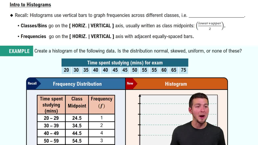
 05:54
05:54