
Ch. 2 - Exploring Data with Tables and Graphs
Triola - Elementary Statistics 14th Edition
Triola14th EditionElementary StatisticsISBN: 9780137366446Not the one you use?Change textbook
Chapter 2, Problem 2.2.19a

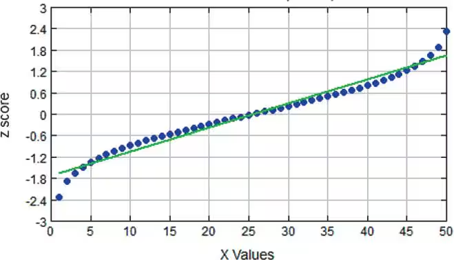
Interpreting Normal Quantile Plots Which of the following normal quantile plots appear to represent data from a population having a normal distribution? Explain.


a. <IMAGE>

Verified step by step guidance
1
Observe the normal quantile plot provided. A normal quantile plot compares the quantiles of the data to the quantiles of a standard normal distribution. If the data is normally distributed, the points should approximately follow a straight line.
Examine the alignment of the data points (blue dots) with the reference line (green line). If the points closely follow the line without significant deviations, the data is likely from a normal distribution.
Check for systematic patterns or curvature in the plot. For example, if the points deviate significantly at the tails (ends of the plot), this could indicate skewness or heavy tails, suggesting the data is not normally distributed.
In the given plot, the points closely follow the green reference line with only minor deviations at the extremes. This suggests that the data is approximately normally distributed.
Conclude that the normal quantile plot appears to represent data from a population having a normal distribution, as the points align well with the reference line, indicating normality.

Verified video answer for a similar problem:

This video solution was recommended by our tutors as helpful for the problem above.
Video duration:
1m
Was this helpful?

Key Concepts

Here are the essential concepts you must grasp in order to answer the question correctly.

Normal Distribution

A normal distribution is a continuous probability distribution characterized by its bell-shaped curve, defined by its mean and standard deviation. In a normal distribution, data points are symmetrically distributed around the mean, with most observations clustering near the center and fewer observations appearing as you move away from the mean. Understanding this concept is crucial for interpreting normal quantile plots, as deviations from this shape indicate non-normality.
Recommended video:
Guided course
09:47
Finding Standard Normal Probabilities using z-Table

Quantile Plot

A quantile plot, specifically a normal quantile plot, is a graphical tool used to assess if a dataset follows a normal distribution. It plots the quantiles of the dataset against the quantiles of a standard normal distribution. If the points in the plot closely follow a straight line, it suggests that the data is normally distributed; deviations from this line indicate departures from normality.
Recommended video:
04:01
Creating Dotplots

Z-scores

Z-scores are standardized scores that indicate how many standard deviations an element is from the mean of the dataset. In the context of normal quantile plots, z-scores are used to transform the data points so that they can be compared to the standard normal distribution. This transformation is essential for determining how well the data fits a normal distribution, as it allows for a direct comparison of the data's distribution to the theoretical normal distribution.
Recommended video:
Guided course
06:31
Z-Scores From Given Probability - TI-84 (CE) Calculator
Related Practice
Textbook Question

In Exercises 1–5, use the data listed in the margin, which are magnitudes (Richter scale) and depths (km) of earthquakes from Data Set 24 “Earthquakes” in Appendix B

[Image]

Frequency Distribution For the frequency distribution from Exercise 1, find the following.


a. Class limits of the first class

b. Class boundaries of the first class

c. Class midpoint of the first class

162
views
Textbook Question

Whatever Use the same data from Exercise 7 to construct a Pareto chart. Which graph does a better job of illustrating the data: Pareto chart or pie chart?

170
views
Textbook Question

Estimating r For each of the following, estimate the value of the linear correlation coefficient r for the given paired data obtained from 50 randomly selected adults.


a. Their heights are measured in inches and those same heights are recorded in centimeters .

148
views
Textbook Question

Estimating r For each of the following, estimate the value of the linear correlation coefficient r for the given paired data obtained from 50 randomly selected adults.


c. Their pulse rates are measured and their IQ scores are measured .

128
views
Textbook Question

Environment


a. After collecting the average (mean) global temperatures for each of the most recent 100 years, we want to construct the graph that is most appropriate for these data. Which graph is best?

89
views
Textbook Question

Body Temperatures Listed below are the temperatures from nine males measured at 8 AM and again at 12 AM (from Data Set 5 “Body Temperatures” in Appendix B). Construct a scatterplot. Based on the graph, does there appear to be a relationship between 8 AM temperatures and 12 AM temperatures?

122
views