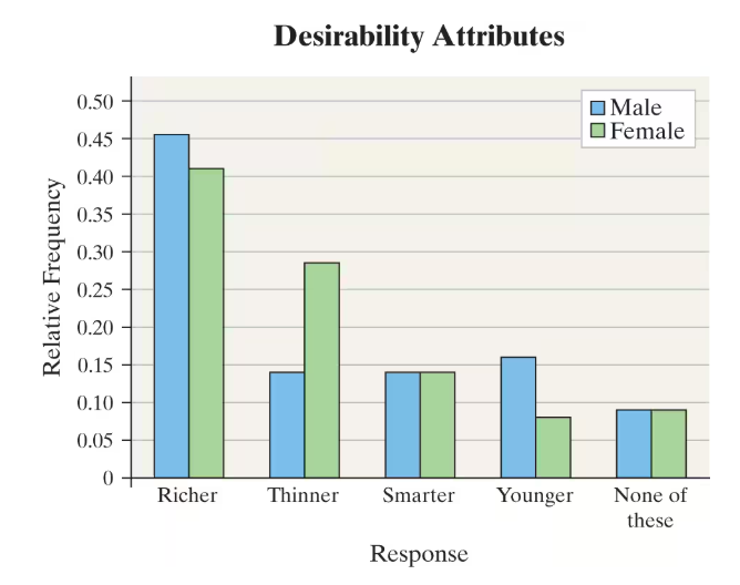
Median Earnings The graph shows the median income for females from 2010 to 2017 in constant 2017 dollars.
a. How is the graph misleading? What does the graph seem to convey?

 Verified step by step guidance
 Verified video answer for a similar problem:


 4:52m
4:52mMaster Creating Bar Graphs and Pareto Charts with a bite sized video explanation from Patrick
Start learning