Poverty The U.S. Census Bureau uses money income thresholds to define poverty. For example, in 2018 the poverty threshold for a family of four with two children was \$25,100. The bar graph represents the number of people living in poverty (in thousands) in the United States in 2017, by ethnicity. How might this graph be misleading?
Table of contents
- 1. Intro to Stats and Collecting Data1h 14m
- 2. Describing Data with Tables and Graphs1h 55m
- 3. Describing Data Numerically2h 5m
- 4. Probability2h 16m
- 5. Binomial Distribution & Discrete Random Variables3h 6m
- 6. Normal Distribution and Continuous Random Variables2h 11m
- 7. Sampling Distributions & Confidence Intervals: Mean3h 23m
- Sampling Distribution of the Sample Mean and Central Limit Theorem19m
- Distribution of Sample Mean - Excel23m
- Introduction to Confidence Intervals15m
- Confidence Intervals for Population Mean1h 18m
- Determining the Minimum Sample Size Required12m
- Finding Probabilities and T Critical Values - Excel28m
- Confidence Intervals for Population Means - Excel25m
- 8. Sampling Distributions & Confidence Intervals: Proportion2h 10m
- 9. Hypothesis Testing for One Sample5h 9m
- Steps in Hypothesis Testing1h 6m
- Performing Hypothesis Tests: Means1h 4m
- Hypothesis Testing: Means - Excel42m
- Performing Hypothesis Tests: Proportions37m
- Hypothesis Testing: Proportions - Excel27m
- Performing Hypothesis Tests: Variance12m
- Critical Values and Rejection Regions28m
- Link Between Confidence Intervals and Hypothesis Testing12m
- Type I & Type II Errors17m
- 10. Hypothesis Testing for Two Samples5h 37m
- Two Proportions1h 13m
- Two Proportions Hypothesis Test - Excel28m
- Two Means - Unknown, Unequal Variance1h 3m
- Two Means - Unknown Variances Hypothesis Test - Excel12m
- Two Means - Unknown, Equal Variance15m
- Two Means - Unknown, Equal Variances Hypothesis Test - Excel9m
- Two Means - Known Variance12m
- Two Means - Sigma Known Hypothesis Test - Excel21m
- Two Means - Matched Pairs (Dependent Samples)42m
- Matched Pairs Hypothesis Test - Excel12m
- Two Variances and F Distribution29m
- Two Variances - Graphing Calculator16m
- 11. Correlation1h 24m
- 12. Regression3h 33m
- Linear Regression & Least Squares Method26m
- Residuals12m
- Coefficient of Determination12m
- Regression Line Equation and Coefficient of Determination - Excel8m
- Finding Residuals and Creating Residual Plots - Excel11m
- Inferences for Slope31m
- Enabling Data Analysis Toolpak1m
- Regression Readout of the Data Analysis Toolpak - Excel21m
- Prediction Intervals13m
- Prediction Intervals - Excel19m
- Multiple Regression - Excel29m
- Quadratic Regression15m
- Quadratic Regression - Excel10m
- 13. Chi-Square Tests & Goodness of Fit2h 21m
- 14. ANOVA2h 28m
2. Describing Data with Tables and Graphs
Bar Graphs and Pareto Charts
Problem 2.1.10a
Textbook Question
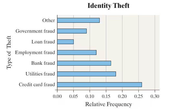
Identity Theft Identity fraud occurs when someone else’s personal information is used to open credit card accounts, apply for a job, receive benefits, and so on. The following relative frequency bar graph represents the various types of identity theft based on a study conducted by the Federal Trade Commission. Approximately what percentage of identity theft was loan fraud (such as applying for a loan in someone else’s name)?

 Verified step by step guidance
1
Step 1: Understand the graph's axes. The horizontal axis represents the relative frequency, which is the proportion of each type of identity theft out of the total cases, and the vertical axis lists the types of identity theft.
Step 2: Locate the bar corresponding to 'Loan fraud' on the vertical axis. This bar shows the relative frequency of loan fraud cases.
Step 3: Observe the length of the 'Loan fraud' bar and compare it to the scale on the horizontal axis to estimate its relative frequency value.
Step 4: Convert the relative frequency to a percentage by multiplying the relative frequency value by 100. For example, if the relative frequency is 0.05, then the percentage is \$0.05 \times 100$.
Step 5: State the approximate percentage of identity theft that was loan fraud based on this calculation.
 Verified video answer for a similar problem:
This video solution was recommended by our tutors as helpful for the problem above
Video duration:
2mPlay a video:
Was this helpful?
Key Concepts
Here are the essential concepts you must grasp in order to answer the question correctly.
Relative Frequency
Relative frequency represents the proportion of times a particular event occurs compared to the total number of events. It is calculated by dividing the frequency of a specific category by the total frequency of all categories. In this context, it shows the percentage of each type of identity theft relative to all reported cases.
Recommended video:
Guided course

Intro to Frequency Distributions
Bar Graph Interpretation
A bar graph visually displays data using bars of different lengths to represent values. The length of each bar corresponds to the relative frequency of each category. Understanding how to read the graph allows you to estimate the percentage or proportion of each type of identity theft, such as loan fraud.
Recommended video:

Creating Bar Graphs and Pareto Charts
Percentage Estimation from Graphs
Estimating percentages from graphs involves interpreting the scale and length of bars relative to the axis labels. By comparing the bar length for loan fraud to the relative frequency scale, you can approximate the percentage it represents, which is essential for answering questions about data distribution.
Recommended video:

Creating Time-Series Graphs

 4:52m
4:52mWatch next
Master Creating Bar Graphs and Pareto Charts with a bite sized video explanation from Patrick
Start learningRelated Videos
Related Practice
Textbook Question
27
views
