Ethics There are data showing that smoking is detrimental to good health. Given that people could be helped and lives could be saved by reducing smoking, is it ethical to graph the data in a way that is misleading by exaggerating the health risks of smoking?
Table of contents
- 1. Intro to Stats and Collecting Data1h 14m
- 2. Describing Data with Tables and Graphs1h 56m
- 3. Describing Data Numerically2h 0m
- 4. Probability2h 17m
- 5. Binomial Distribution & Discrete Random Variables3h 6m
- 6. Normal Distribution and Continuous Random Variables2h 11m
- 7. Sampling Distributions & Confidence Intervals: Mean3h 23m
- Sampling Distribution of the Sample Mean and Central Limit Theorem19m
- Distribution of Sample Mean - ExcelBonus23m
- Introduction to Confidence Intervals15m
- Confidence Intervals for Population Mean1h 18m
- Determining the Minimum Sample Size Required12m
- Finding Probabilities and T Critical Values - ExcelBonus28m
- Confidence Intervals for Population Means - ExcelBonus25m
- 8. Sampling Distributions & Confidence Intervals: Proportion2h 10m
- 9. Hypothesis Testing for One Sample5h 8m
- Steps in Hypothesis Testing1h 6m
- Performing Hypothesis Tests: Means1h 4m
- Hypothesis Testing: Means - ExcelBonus42m
- Performing Hypothesis Tests: Proportions37m
- Hypothesis Testing: Proportions - ExcelBonus27m
- Performing Hypothesis Tests: Variance12m
- Critical Values and Rejection Regions28m
- Link Between Confidence Intervals and Hypothesis Testing12m
- Type I & Type II Errors16m
- 10. Hypothesis Testing for Two Samples5h 37m
- Two Proportions1h 13m
- Two Proportions Hypothesis Test - ExcelBonus28m
- Two Means - Unknown, Unequal Variance1h 3m
- Two Means - Unknown Variances Hypothesis Test - ExcelBonus12m
- Two Means - Unknown, Equal Variance15m
- Two Means - Unknown, Equal Variances Hypothesis Test - ExcelBonus9m
- Two Means - Known Variance12m
- Two Means - Sigma Known Hypothesis Test - ExcelBonus21m
- Two Means - Matched Pairs (Dependent Samples)42m
- Matched Pairs Hypothesis Test - ExcelBonus12m
- Two Variances and F Distribution29m
- Two Variances - Graphing CalculatorBonus16m
- 11. Correlation1h 24m
- 12. Regression3h 33m
- Linear Regression & Least Squares Method26m
- Residuals12m
- Coefficient of Determination12m
- Regression Line Equation and Coefficient of Determination - ExcelBonus8m
- Finding Residuals and Creating Residual Plots - ExcelBonus11m
- Inferences for Slope31m
- Enabling Data Analysis ToolpakBonus1m
- Regression Readout of the Data Analysis Toolpak - ExcelBonus21m
- Prediction Intervals13m
- Prediction Intervals - ExcelBonus19m
- Multiple Regression - ExcelBonus29m
- Quadratic Regression15m
- Quadratic Regression - ExcelBonus10m
- 13. Chi-Square Tests & Goodness of Fit2h 21m
- 14. ANOVA2h 29m
2. Describing Data with Tables and Graphs
Visualizing Qualitative vs. Quantitative Data
Problem 10.1.11a
Textbook Question
Explore!
Exercises 11 and 12 provide two data sets from “Graphs in Statistical Analysis,” by F. J. Anscombe, the American Statistician, Vol. 27. For each exercise,

a. Construct a scatterplot.
 Verified step by step guidance
1
Step 1: Begin by identifying the data points from the table. Each pair of (x, y) values represents a coordinate in the scatterplot. For example, the first pair is (10, 9.14), the second pair is (8, 8.14), and so on.
Step 2: Set up a graph with an x-axis and y-axis. Label the x-axis with the values of 'x' and the y-axis with the values of 'y'. Ensure the axes cover the range of the data provided (x values range from 4 to 14, and y values range from 3.10 to 9.26).
Step 3: Plot each data point on the graph. For example, plot (10, 9.14) by locating 10 on the x-axis and 9.14 on the y-axis, then marking the point where these values intersect. Repeat this for all pairs in the table.
Step 4: After plotting all points, visually inspect the scatterplot to observe any patterns, trends, or clusters. This will help in understanding the relationship between x and y.
Step 5: Optionally, add a title to the scatterplot and label the axes to make the graph more informative. For example, the title could be 'Scatterplot of x vs. y', and the axes could be labeled 'x values' and 'y values'.
 Verified video answer for a similar problem:
This video solution was recommended by our tutors as helpful for the problem above
Video duration:
1mPlay a video:
0 Comments
Key Concepts
Here are the essential concepts you must grasp in order to answer the question correctly.
Scatterplot
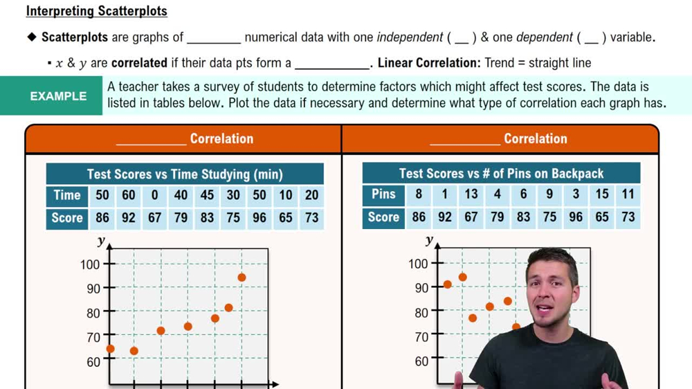
A scatterplot is a graphical representation of two variables, where each point represents an observation in the dataset. The x-axis typically represents the independent variable, while the y-axis represents the dependent variable. This visualization helps identify relationships, trends, or patterns between the variables, such as correlation or clustering.
Recommended video:
Guided course

Scatterplots & Intro to Correlation
Correlation
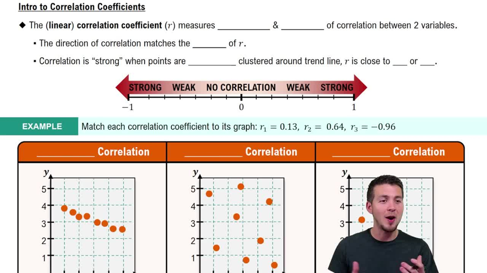
Correlation measures the strength and direction of a linear relationship between two variables. It is quantified using the correlation coefficient, which ranges from -1 to 1. A value close to 1 indicates a strong positive correlation, while a value close to -1 indicates a strong negative correlation. Understanding correlation is essential for interpreting scatterplots and assessing the relationship between the x and y values.
Recommended video:
Guided course

Correlation Coefficient
Data Sets
A data set is a collection of related data points, typically organized in a table format with rows and columns. In this context, the data set consists of paired x and y values, which can be analyzed to explore relationships. Understanding how to interpret and manipulate data sets is fundamental for statistical analysis, including creating visualizations like scatterplots.
Recommended video:

Introduction to Collecting Data
Related Videos
Related Practice
Textbook Question
107
views


