Ch. 2 - Exploring Data with Tables and Graphs
Triola - Elementary Statistics 14th Edition
Triola14th EditionElementary StatisticsISBN: 9780137366446Not the one you use?Change textbook
Chapter 2, Problem 2.CQQ.5

Tornado Alley A stemplot of the same data summarized in Exercise 1 is created, and one of the rows of that stemplot is 3 | 000144669. Identify the values represented by that row of the stemplot.

Verified step by step guidance
1
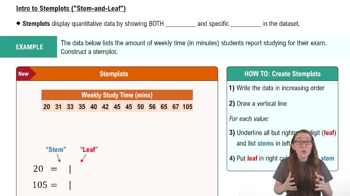
Understand the structure of a stemplot: A stemplot (or stem-and-leaf plot) is a way to display quantitative data. The 'stem' represents the leading digits (e.g., tens place), and the 'leaf' represents the trailing digits (e.g., ones place).
Interpret the given row: The row '3 | 000144669' means that the stem is '3' and the leaves are '0, 0, 0, 1, 4, 4, 6, 6, 9'. Each leaf is combined with the stem to form a complete number.
Combine the stem and leaves: For each leaf, append it to the stem to form the full values. For example, the first leaf '0' combined with the stem '3' gives the value '30'. Repeat this for all leaves.
List the values: The full values represented by this row are 30, 30, 30, 31, 34, 34, 36, 36, and 39.
Verify the interpretation: Double-check that each leaf has been correctly combined with the stem and that all values are accounted for in the list.

Verified video answer for a similar problem:

This video solution was recommended by our tutors as helpful for the problem above.
Video duration:
1m
Was this helpful?

Key Concepts

Here are the essential concepts you must grasp in order to answer the question correctly.

Stemplot

A stemplot, or stem-and-leaf plot, is a graphical representation of quantitative data that organizes values into 'stems' and 'leaves.' The stem represents the leading digit(s) of the data values, while the leaves represent the trailing digits. For example, in the row '3 | 000144669', the stem '3' indicates that all values are in the 30s, and the leaves '000144669' represent the specific values 30, 30, 30, 31, 34, 36, 36, and 39.
Recommended video:
06:23
Creating Stemplots

Data Interpretation

Data interpretation involves analyzing and making sense of data presented in various formats, such as stemplots. It requires understanding how to extract meaningful information from the visual representation. In this case, interpreting the stemplot allows us to identify the specific values that fall within the range indicated by the stem, which is crucial for further statistical analysis.
Recommended video:
Guided course
04:39
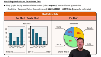
Visualizing Qualitative vs. Quantitative Data

Quantitative Data

Quantitative data refers to numerical information that can be measured and expressed mathematically. It is often used in statistics to perform calculations, create visualizations, and derive insights. The values represented in the stemplot are quantitative, as they reflect measurable quantities (e.g., counts, measurements) that can be analyzed to understand trends or patterns in the data.
Recommended video:
Guided course
04:39
Visualizing Qualitative vs. Quantitative Data
Related Practice
Textbook Question

Normal Distribution If the following data are randomly selected, which are expected to have a normal distribution?


a. Weights of Reese’s Peanut Butter Cups

151
views

Textbook Question

Seatbelts The Beams Seatbelts company manufactures—well, you know. When a sample of seatbelts is tested for breaking point (measured in kilograms), the sample data are explored. Identify the important characteristic of data that is missing from this list: center, distribution, outliers, changing characteristics over time.

105
views
Textbook Question

In Exercises 9–18, construct the histograms and answer the given questions.


Tornadoes Use the frequency distribution from Exercise 16 in Section 2-1 to construct a histogram. Does the histogram appear to be skewed? If so, identify the type of skewness.

134
views
Textbook Question

More IQ Scores The population of IQ scores of adults is normally distributed. If we obtain a voluntary response sample of 5000 of those IQ scores, will a histogram of the sample be bell-shaped?

184
views
Textbook Question

Computers As a quality control manager at Texas Instruments, you find that defective calculators have various causes, including worn machinery, human error, bad supplies, and packaging mistreatment. Which of the following graphs would be best for describing the causes of defects: histogram; scatterplot; Pareto chart; dotplot; pie chart?

105
views
Textbook Question

In Exercises 9–18, construct the histograms and answer the given questions.


Hershey’s Kisses Use the frequency distribution from Exercise 20 in Section 2-1 to construct a histogram. In using a strict interpretation of the criteria for being a normal distribution, does the histogram appear to depict data from a population with a normal distribution?

145
views