Ch. 2 - Descriptive Statistics
Larson - Elementary Statistics: Picturing the World 8th Edition
Larson8th EditionElementary Statistics: Picturing the WorldISBN: 9780137493470Not the one you use?Change textbook
Chapter 2, Problem 2.4.42

Estimating the Sample Mean and Standard Deviation for Grouped Data In Exercises 41–44, make a frequency distribution for the data. Then use the table to estimate the sample mean and the sample standard deviation of the data set.
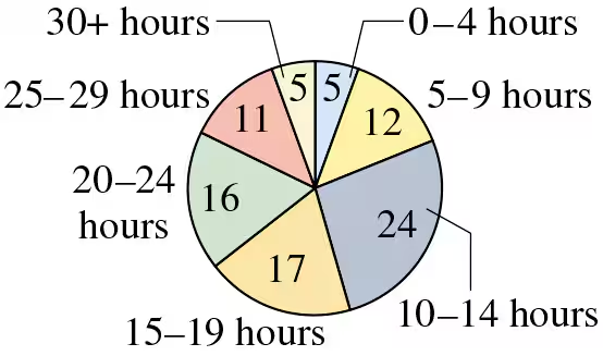
Weekly Study Hours The distribution of the number of hours that a random sample of college students study per week is shown in the pie chart. Use 32 as the midpoint for “30+ hours.”
Pie chart showing the distribution of weekly study hours among college students, with segments labeled by hour ranges and frequencies.

Verified step by step guidance
1
Step 1: Create a frequency distribution table. Use the pie chart to list the study hour intervals (e.g., 0–4 hours, 5–9 hours, etc.) and their corresponding frequencies (e.g., 5, 12, etc.). Assign midpoints to each interval. For example, the midpoint for 0–4 hours is 2, for 5–9 hours is 7, and so on. Use 32 as the midpoint for '30+ hours.'
Step 2: Calculate the estimated sample mean. Use the formula for the mean of grouped data: \( \text{Mean} = \frac{\sum (f \cdot x)}{\sum f} \), where \( f \) is the frequency and \( x \) is the midpoint of each interval. Multiply each frequency by its corresponding midpoint, sum these products, and divide by the total frequency.
Step 3: Calculate the estimated sample variance. Use the formula for variance of grouped data: \( \text{Variance} = \frac{\sum f \cdot (x - \text{Mean})^2}{\sum f} \). Subtract the mean from each midpoint, square the result, multiply by the frequency, and sum these values. Divide by the total frequency.
Step 4: Calculate the estimated sample standard deviation. Take the square root of the variance obtained in Step 3. The formula is \( \text{Standard Deviation} = \sqrt{\text{Variance}} \).
Step 5: Interpret the results. The sample mean represents the average weekly study hours for the group, and the standard deviation indicates the variability in study hours among the students.

Verified video answer for a similar problem:

This video solution was recommended by our tutors as helpful for the problem above.
Video duration:
6m
Was this helpful?

Key Concepts

Here are the essential concepts you must grasp in order to answer the question correctly.

Frequency Distribution

A frequency distribution is a summary of how often each value occurs in a dataset. It organizes data into categories or intervals, showing the number of observations within each category. In this case, the pie chart represents the frequency of college students studying within specified hour ranges, which helps visualize the distribution of study hours.
Recommended video:
Guided course
06:38
Intro to Frequency Distributions

Sample Mean

The sample mean is the average of a set of values, calculated by summing all the observations and dividing by the number of observations. For grouped data, the mean can be estimated using the midpoints of each interval multiplied by their respective frequencies, then divided by the total number of observations. This provides a central value that represents the data set.
Recommended video:
05:11
Sampling Distribution of Sample Proportion

Sample Standard Deviation

The sample standard deviation measures the amount of variation or dispersion in a set of values. It quantifies how much the values deviate from the sample mean. For grouped data, it is calculated using the squared differences between each midpoint and the mean, weighted by the frequencies, and then taking the square root of the average of these squared differences.
Recommended video:
Guided course
08:45
Calculating Standard Deviation
Related Practice
Textbook Question

In Exercises 37– 40, without performing any calculations, determine which measure of central tendency best represents the graphed data. Explain your reasoning.


" style="" width="300">

87
views
Textbook Question

Graphing Data Sets In Exercises 17–32, organize the data using the indicated type of graph. Describe any patterns.


Smartphone Sales The five best-selling smartphone manufacturers of 2020 were Apple (206.1 million units), Huawei (189.0 million units), Samsung (266.7 million units), vivo (111.7 million units), and Xiaomi (147.8 million units). Use a Pareto chart to display the data. (Source: International Data Corporation)

145
views
Textbook Question

Graphing Data Sets In Exercises 17–32, organize the data using the indicated type of graph. Describe any patterns.


Highest-Paid Athletes Use a stem-and-leaf plot that has two rows for each stem to display the data, which represent the incomes (in millions) of the top 30 highest-paid athletes. (Source: Forbes Media LLC)

39 42 41 45 48 48 106 45 88 54 61 37 62 74 40

47 56 57 105 96 37 48 41 64 52 47 45 59 49 104

118
views
Textbook Question

Graphical Analysis In Exercises 9–12, use the stem-and-leaf plot or dot plot to list the actual data entries. What is the maximum data entry? What is the minimum data entry?


" style="" width="385">

255
views
Textbook Question

Graphical Analysis In Exercises 21–24, you are asked to compare three data sets.


(c) Estimate the sample standard deviations. Then determine how close each of your estimates is by finding the sample standard deviations.


i. ii. iii.

69
views
Textbook Question

Salary Offers You are applying for jobs at two companies. Company C offers starting salaries with μ = \$59,000 and σ = \$1500. Company D offers starting salaries with μ = \$59,000 and σ = \$1000. From which company are you more likely to get an offer of \$62,000 or more? Explain your reasoning.

124
views