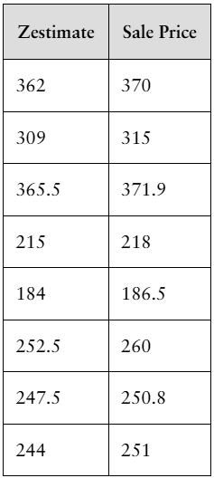
"[DATA] Influential Observations Zillow.com is a site that can be used to assess the value of homes in your neighborhood. The organization provides a list of homes for sale as well as a Zestimate, which is the price Zillow believes the home will sell for. The following data represent the Zestimate and sale price (in thousands of dollars) of a random sample of recently sold homes in Charleston, South Carolina. a. Draw a scatter diagram of the data, treating the Zestimate as the explanatory variable and sale price as the response variable."
Verified step by step guidance
1
Step 1: Identify the variables for the scatter plot. Here, the explanatory variable (independent variable) is the Zestimate, and the response variable (dependent variable) is the Sale Price.
Step 2: Set up a coordinate system with the Zestimate values on the horizontal axis (x-axis) and the Sale Price values on the vertical axis (y-axis).
Step 3: For each pair of data points (Zestimate, Sale Price), plot a point on the graph where the x-coordinate corresponds to the Zestimate and the y-coordinate corresponds to the Sale Price. For example, plot the point (362, 370), then (309, 315), and so on for all data pairs.
Step 4: After plotting all points, observe the overall pattern or trend. This helps in understanding the relationship between Zestimate and Sale Price, such as whether they tend to increase together.
Step 5: Optionally, label the axes with appropriate titles and units (e.g., 'Zestimate (thousands of dollars)' and 'Sale Price (thousands of dollars)') to make the scatter plot clear and informative.
Verified video answer for a similar problem:
This video solution was recommended by our tutors as helpful for the problem above
Video duration:
1m
Play a video:
0 Comments
Key Concepts
Here are the essential concepts you must grasp in order to answer the question correctly.
Scatter Diagram
A scatter diagram is a graphical representation that displays the relationship between two quantitative variables. Each point on the plot corresponds to one observation, with the explanatory variable on the x-axis and the response variable on the y-axis. It helps visualize patterns, trends, or correlations between variables.
In statistical analysis, the explanatory variable (independent variable) is the one used to predict or explain changes in another variable, while the response variable (dependent variable) is the outcome being studied. Here, Zestimate is the explanatory variable, and sale price is the response variable.
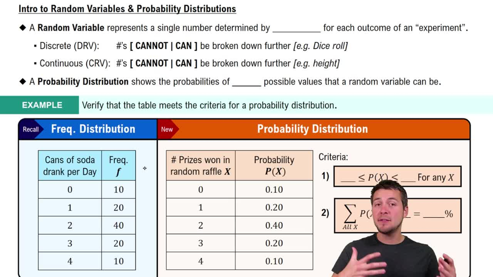
Intro to Random Variables & Probability Distributions
Influential Observations
Influential observations are data points that have a significant impact on the results of a statistical analysis, such as regression. They can disproportionately affect the slope or intercept of a fitted line, so identifying them through scatter plots is important for accurate modeling and interpretation.

 Verified step by step guidance
 5:14
5:14