Which of the following best describes how a Pareto chart differs from a standard vertical bar graph?
Table of contents
- 1. Intro to Stats and Collecting Data1h 14m
- 2. Describing Data with Tables and Graphs1h 55m
- 3. Describing Data Numerically2h 5m
- 4. Probability2h 16m
- 5. Binomial Distribution & Discrete Random Variables3h 6m
- 6. Normal Distribution and Continuous Random Variables2h 11m
- 7. Sampling Distributions & Confidence Intervals: Mean3h 23m
- Sampling Distribution of the Sample Mean and Central Limit Theorem19m
- Distribution of Sample Mean - Excel23m
- Introduction to Confidence Intervals15m
- Confidence Intervals for Population Mean1h 18m
- Determining the Minimum Sample Size Required12m
- Finding Probabilities and T Critical Values - Excel28m
- Confidence Intervals for Population Means - Excel25m
- 8. Sampling Distributions & Confidence Intervals: Proportion2h 10m
- 9. Hypothesis Testing for One Sample5h 6m
- Steps in Hypothesis Testing1h 6m
- Performing Hypothesis Tests: Means1h 4m
- Hypothesis Testing: Means - Excel42m
- Performing Hypothesis Tests: Proportions37m
- Hypothesis Testing: Proportions - Excel27m
- Performing Hypothesis Tests: Variance12m
- Critical Values and Rejection Regions28m
- Link Between Confidence Intervals and Hypothesis Testing12m
- Type I & Type II Errors15m
- 10. Hypothesis Testing for Two Samples4h 50m
- Two Proportions1h 13m
- Two Proportions Hypothesis Test - Excel28m
- Two Means - Unknown, Unequal Variance1h 3m
- Two Means - Unknown Variances Hypothesis Test - Excel12m
- Two Means - Unknown, Equal Variance15m
- Two Means - Unknown, Equal Variances Hypothesis Test - Excel9m
- Two Means - Known Variance12m
- Two Means - Sigma Known Hypothesis Test - Excel21m
- Two Means - Matched Pairs (Dependent Samples)42m
- Matched Pairs Hypothesis Test - Excel12m
- 11. Correlation1h 24m
- 12. Regression3h 33m
- Linear Regression & Least Squares Method26m
- Residuals12m
- Coefficient of Determination12m
- Regression Line Equation and Coefficient of Determination - Excel8m
- Finding Residuals and Creating Residual Plots - Excel11m
- Inferences for Slope31m
- Enabling Data Analysis Toolpak1m
- Regression Readout of the Data Analysis Toolpak - Excel21m
- Prediction Intervals13m
- Prediction Intervals - Excel19m
- Multiple Regression - Excel29m
- Quadratic Regression15m
- Quadratic Regression - Excel10m
- 13. Chi-Square Tests & Goodness of Fit2h 21m
- 14. ANOVA1h 57m
2. Describing Data with Tables and Graphs
Bar Graphs and Pareto Charts
Struggling with Statistics?
Join thousands of students who trust us to help them ace their exams!Watch the first videoMultiple Choice
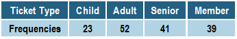
Using the table below, which category would appear first in a Pareto Chart representing the data?

A
Child
B
Adult
C
Senior
D
Member
Verified step by step guidance1
Step 1: Understand the concept of a Pareto Chart. A Pareto Chart is a type of bar chart where categories are ordered by frequency, from highest to lowest. The category with the highest frequency appears first.
Step 2: Examine the table provided. The table lists ticket types (Child, Adult, Senior, Member) and their corresponding frequencies (23, 52, 41, 39).
Step 3: Identify the category with the highest frequency. Compare the frequencies: 23 (Child), 52 (Adult), 41 (Senior), and 39 (Member). The highest frequency is 52, which corresponds to the Adult category.
Step 4: Arrange the categories in descending order of frequency for the Pareto Chart. Start with the category with the highest frequency (Adult), followed by the next highest frequencies (Senior, Member, Child).
Step 5: Conclude that the category 'Adult' would appear first in the Pareto Chart, as it has the highest frequency of 52.
Watch next
Master Creating Bar Graphs and Pareto Charts with a bite sized video explanation from Patrick
Start learningRelated Videos
Related Practice
Multiple Choice
21
views
Bar Graphs and Pareto Charts practice set

