Bar graphs compare values across categories using which of the following to display their information?
Table of contents
- 1. Intro to Stats and Collecting Data1h 14m
- 2. Describing Data with Tables and Graphs1h 56m
- 3. Describing Data Numerically2h 0m
- 4. Probability2h 17m
- 5. Binomial Distribution & Discrete Random Variables3h 6m
- 6. Normal Distribution and Continuous Random Variables2h 11m
- 7. Sampling Distributions & Confidence Intervals: Mean3h 23m
- Sampling Distribution of the Sample Mean and Central Limit Theorem19m
- Distribution of Sample Mean - ExcelBonus23m
- Introduction to Confidence Intervals15m
- Confidence Intervals for Population Mean1h 18m
- Determining the Minimum Sample Size Required12m
- Finding Probabilities and T Critical Values - ExcelBonus28m
- Confidence Intervals for Population Means - ExcelBonus25m
- 8. Sampling Distributions & Confidence Intervals: Proportion2h 10m
- 9. Hypothesis Testing for One Sample5h 8m
- Steps in Hypothesis Testing1h 6m
- Performing Hypothesis Tests: Means1h 4m
- Hypothesis Testing: Means - ExcelBonus42m
- Performing Hypothesis Tests: Proportions37m
- Hypothesis Testing: Proportions - ExcelBonus27m
- Performing Hypothesis Tests: Variance12m
- Critical Values and Rejection Regions28m
- Link Between Confidence Intervals and Hypothesis Testing12m
- Type I & Type II Errors16m
- 10. Hypothesis Testing for Two Samples5h 37m
- Two Proportions1h 13m
- Two Proportions Hypothesis Test - ExcelBonus28m
- Two Means - Unknown, Unequal Variance1h 3m
- Two Means - Unknown Variances Hypothesis Test - ExcelBonus12m
- Two Means - Unknown, Equal Variance15m
- Two Means - Unknown, Equal Variances Hypothesis Test - ExcelBonus9m
- Two Means - Known Variance12m
- Two Means - Sigma Known Hypothesis Test - ExcelBonus21m
- Two Means - Matched Pairs (Dependent Samples)42m
- Matched Pairs Hypothesis Test - ExcelBonus12m
- Two Variances and F Distribution29m
- Two Variances - Graphing CalculatorBonus16m
- 11. Correlation1h 24m
- 12. Regression3h 33m
- Linear Regression & Least Squares Method26m
- Residuals12m
- Coefficient of Determination12m
- Regression Line Equation and Coefficient of Determination - ExcelBonus8m
- Finding Residuals and Creating Residual Plots - ExcelBonus11m
- Inferences for Slope31m
- Enabling Data Analysis ToolpakBonus1m
- Regression Readout of the Data Analysis Toolpak - ExcelBonus21m
- Prediction Intervals13m
- Prediction Intervals - ExcelBonus19m
- Multiple Regression - ExcelBonus29m
- Quadratic Regression15m
- Quadratic Regression - ExcelBonus10m
- 13. Chi-Square Tests & Goodness of Fit2h 21m
- 14. ANOVA2h 29m
2. Describing Data with Tables and Graphs
Bar Graphs and Pareto Charts
Problem 2.2.37
Textbook Question
Extending Concepts
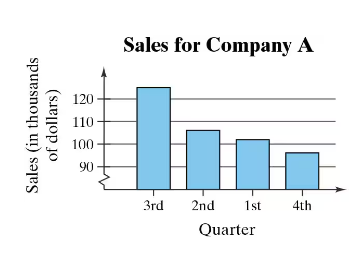
A Misleading Graph? A misleading graph is not drawn appropriately, which can misrepresent data and lead to false conclusions. In Exercises 37–40, (a) explain why the graph is misleading, and (b) redraw the graph so that it is not misleading.

 Verified step by step guidance
1
Step 1: Analyze the graph provided. Notice that the vertical axis (Sales in thousands of dollars) does not start at zero but instead starts at 90. This can exaggerate the differences between the bars and make the changes in sales appear more dramatic than they actually are.
Step 2: Explain why the graph is misleading. By not starting the vertical axis at zero, the graph visually distorts the proportional differences between the sales figures for each quarter. This can lead viewers to believe that the sales differences are larger than they truly are.
Step 3: To redraw the graph so that it is not misleading, start the vertical axis at zero. This ensures that the visual representation of the data accurately reflects the true differences in sales figures.
Step 4: Ensure that the spacing between the bars and the scaling of the vertical axis are consistent. This helps maintain clarity and avoids any visual distortion.
Step 5: Label the axes clearly and use appropriate increments on the vertical axis to represent the sales data accurately. This will make the graph more honest and easier to interpret.
 Verified video answer for a similar problem:
This video solution was recommended by our tutors as helpful for the problem above
Video duration:
1mPlay a video:
0 Comments
Key Concepts
Here are the essential concepts you must grasp in order to answer the question correctly.
Misleading Graphs
A misleading graph is one that distorts the data it represents, often through inappropriate scaling, selective data presentation, or visual exaggeration. Such graphs can lead viewers to incorrect interpretations or conclusions about the data. For example, if the y-axis does not start at zero, it can exaggerate differences between data points, making trends appear more dramatic than they are.
Recommended video:

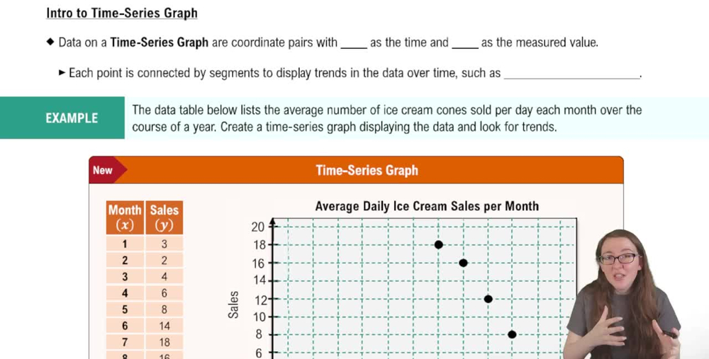
Creating Time-Series Graphs
Bar Graphs
Bar graphs are visual representations of data where individual bars represent different categories or groups. The height or length of each bar correlates with the value it represents, making it easy to compare quantities. However, the design of bar graphs must be clear and proportional to accurately convey the information; otherwise, they can mislead the audience.
Recommended video:

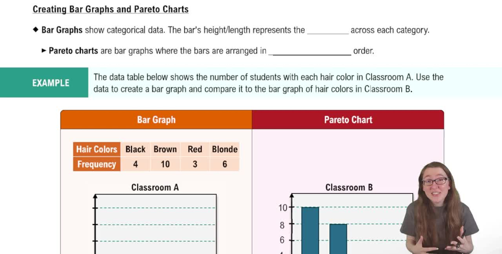
Creating Bar Graphs and Pareto Charts
Data Representation
Data representation refers to the methods used to visually display data, such as graphs, charts, and tables. Effective data representation should accurately reflect the underlying data and allow for easy interpretation. When creating visualizations, it is crucial to consider factors like scale, labeling, and context to ensure that the audience can draw valid conclusions from the presented information.
Recommended video:

Introduction to Collecting Data
Related Videos
Related Practice
Multiple Choice
102
views


