
Ch. 2 - Exploring Data with Tables and Graphs
Triola - Elementary Statistics 14th Edition
Triola14th EditionElementary StatisticsISBN: 9780137366446Not the one you use?Change textbook
Chapter 2, Problem 2.3.13

In Exercises 13 and 14, construct the pie chart.


Box Office Boffo Use the data from Exercise 11 “Box Office Boffo.”
"Recent annual gross revenue (millions of dollars) for the leading movie studios are as follows: 20th Century Fox (1082), Buena Vista (3092), Paramount (757), Sony/Columbia (1304), Universal (1772), Warner Brothers (1941)."

Verified step by step guidance
1
Step 1: Calculate the total gross revenue by summing up the values for all movie studios. Add the revenues: 1082 + 3092 + 757 + 1304 + 1772 + 1941.
Step 2: Determine the proportion of each studio's revenue relative to the total revenue. For each studio, divide its revenue by the total revenue calculated in Step 1. For example, for 20th Century Fox, calculate: (1082 / Total Revenue).
Step 3: Convert each proportion into a percentage by multiplying the result from Step 2 by 100. For example, for 20th Century Fox, calculate: (Proportion × 100).
Step 4: Calculate the angle for each sector of the pie chart. Since a pie chart represents 360 degrees, multiply each studio's proportion (from Step 2) by 360 to find the angle for its sector. For example, for 20th Century Fox, calculate: (Proportion × 360).
Step 5: Draw the pie chart using the angles calculated in Step 4. Label each sector with the studio name and its corresponding percentage (from Step 3). Ensure the chart visually represents the relative sizes of the revenues.

Verified video answer for a similar problem:

This video solution was recommended by our tutors as helpful for the problem above.
Video duration:
1m
Was this helpful?

Key Concepts

Here are the essential concepts you must grasp in order to answer the question correctly.

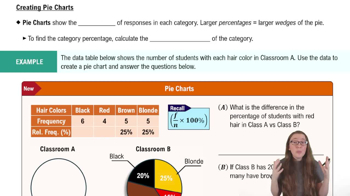
Pie Chart

A pie chart is a circular statistical graphic that is divided into slices to illustrate numerical proportions. Each slice represents a category's contribution to the total, making it easy to visualize relative sizes. In this context, the pie chart will display the gross revenue of different movie studios as parts of a whole, allowing for quick comparisons.
Recommended video:
06:10
Creating Pie Charts

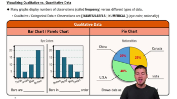
Data Representation

Data representation involves organizing and presenting data in a visual format to facilitate understanding and analysis. In the case of the box office revenues, representing the data in a pie chart helps to convey the distribution of revenue among the studios clearly, highlighting which studios dominate the market and how they compare to one another.
Recommended video:
Guided course
04:39
Visualizing Qualitative vs. Quantitative Data

Proportional Relationships

Proportional relationships refer to the way in which two quantities relate to each other in terms of their size or amount. In the context of the pie chart, the size of each slice corresponds to the proportion of each studio's revenue relative to the total revenue of all studios combined. Understanding these relationships is crucial for interpreting the pie chart accurately.
Recommended video:
Guided course
09:27
Difference in Proportions: Hypothesis Tests
Related Practice
Textbook Question

V and Digital Ads Listed below are amounts (billions of dollars) spent on TV and digital advertising. The amounts are listed in order by year ending with the year 2022. The last few years are projected amounts (based on data from Magna Global). Construct a graph that reveals the story that the data are trying to tell. What story does the graph depict?

TV Ads:

[Image]

105
views
Textbook Question

In Exercises 5–8, identify the class width, class midpoints, and class boundaries for the given frequency distribution. Also identify the number of individuals included in the summary. The frequency distributions are based on real data from Appendix B.

7.

449
views
Textbook Question

Freshman 15 Refer to Data Set 13 “Freshman 15” and use the second column, which lists weights (kg) in September of college freshmen. Begin with a lower class limit of 40 kg and use a class width of 10 kg. Does the distribution appear to be a normal distribution?

167
views
Textbook Question

Analysis of Last Digits Weights of respondents were recorded as part of the California Health Interview Survey. The last digits of weights from 50 randomly selected respondents are listed below. Construct a frequency distribution with 10 classes. Based on the distribution, do the weights appear to be reported or actually measured? Does there appear to be a gap in the frequencies and, if so, how might that gap be explained? What do you know about the accuracy of the results?

126
views
Textbook Question

Ethics There are data showing that smoking is detrimental to good health. Given that people could be helped and lives could be saved by reducing smoking, is it ethical to graph the data in a way that is misleading by exaggerating the health risks of smoking?

124
views
Textbook Question

Cell Phone Radiation If we collect a sample of cell phone radiation amounts much larger than the sample included with Exercise 3, and if our sample includes a single outlier, how will that outlier appear in a histogram?

151
views