Ch. 2 - Exploring Data with Tables and Graphs
Triola - Elementary Statistics 14th Edition
Triola14th EditionElementary StatisticsISBN: 9780137366446Not the one you use?Change textbook
Chapter 2, Problem 2.3.10

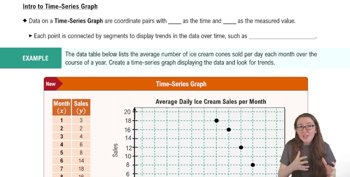
In Exercises 9 and 10, construct the time-series graph.


Home Runs Listed below are the numbers of home runs in Major League Baseball for each year beginning with 1993 (listed in order by row). Is there a trend?
Table displaying home run statistics in Major League Baseball from 1993 onwards, showing yearly totals.

Verified step by step guidance
1
Step 1: Organize the data into a table where each year corresponds to the number of home runs. Start with 1993 and increment the year for each data point.
Step 2: Create a time-series graph by plotting the years on the x-axis and the number of home runs on the y-axis. Ensure the scale is appropriate to capture the variation in the data.
Step 3: Connect the data points with a line to visualize the trend over time. This will help identify any patterns or changes in the number of home runs.
Step 4: Analyze the graph to determine if there is a trend. Look for consistent increases, decreases, or fluctuations in the number of home runs over the years.
Step 5: Summarize your findings based on the graph. For example, if the graph shows an upward trend, you can conclude that the number of home runs has generally increased over time. If the graph shows no clear pattern, you can conclude that there is no significant trend.

Verified video answer for a similar problem:

This video solution was recommended by our tutors as helpful for the problem above.
Video duration:
2m
Was this helpful?

Key Concepts

Here are the essential concepts you must grasp in order to answer the question correctly.

Time-Series Data

Time-series data consists of observations collected at regular intervals over time. In this context, the data represents the number of home runs in Major League Baseball for each year from 1993 onwards. Analyzing time-series data helps identify trends, patterns, and fluctuations over time, which is essential for understanding changes in performance or behavior.
Recommended video:
04:13
Creating Time-Series Graphs

Trend Analysis

Trend analysis involves examining data over a period to identify consistent patterns or movements in a particular direction. In the case of home runs, trend analysis will help determine whether the number of home runs is increasing, decreasing, or remaining stable over the years. This analysis is crucial for making predictions and understanding the dynamics of the sport.
Recommended video:
04:13
Creating Time-Series Graphs

Graphical Representation

Graphical representation, such as time-series graphs, visually displays data points over time, making it easier to interpret trends and patterns. By plotting the yearly home run totals on a graph, one can quickly assess the overall trajectory of home runs in Major League Baseball, facilitating a clearer understanding of the data compared to raw numbers alone.
Recommended video:
Guided course
05:54
Intro to Histograms
Related Practice
Textbook Question

IQ Scores IQ scores of adults are normally distributed. If a large sample of adults is randomly selected and the IQ scores are illustrated in a histogram, what is the shape of that histogram?

250
views
Textbook Question

In Exercises 17–20, identify how the graph is deceptive.


Cost of Giving Birth According to the Agency for Healthcare Research and Quality Healthcare Cost and Utilization Project, the typical cost of a C-section baby delivery is \$4500, and the typical cost of a vaginal delivery is \$2600. See the following illustration.


128
views
Textbook Question

In Exercises 5 and 6, construct the dotplot.


Diastolic Blood Pressure Listed below are diastolic blood pressure measurements (mm Hg) of females selected from Data Set 1 “Body Data” in Appendix B. All of the values are even numbers. Are there any outliers? If so, identify their values.

102
views
Textbook Question

In Exercises 9–18, construct the histograms and answer the given questions.


Analysis of Last Digits Use the frequency distribution from Exercise 21 in Section 2-1 to construct a histogram. What can be concluded from the distribution of the digits? Specifically, do the heights appear to be reported or actually measured?

142
views
Textbook Question

Boston Commute Time The accompanying table summarizes daily commute times in Boston. How many commute times are included in the summary? Is it possible to identify the exact values of all of the original data amounts?

191
views
Textbook Question

Use Table 2-11 to find the critical values of r. Based on a comparison of the linear correlation coefficient r and the critical values, what do you conclude about a linear correlation?

Using the data from Exercise 6 “Airport Data Speeds,” the linear correlation coefficient is r = 0.866

255
views