Computers As a quality control manager at Texas Instruments, you find that defective calculators have various causes, including worn machinery, human error, bad supplies, and packaging mistreatment. Which of the following graphs would be best for describing the causes of defects: histogram; scatterplot; Pareto chart; dotplot; pie chart?
Table of contents
- 1. Intro to Stats and Collecting Data1h 14m
- 2. Describing Data with Tables and Graphs1h 56m
- 3. Describing Data Numerically2h 0m
- 4. Probability2h 17m
- 5. Binomial Distribution & Discrete Random Variables3h 6m
- 6. Normal Distribution and Continuous Random Variables2h 11m
- 7. Sampling Distributions & Confidence Intervals: Mean3h 23m
- Sampling Distribution of the Sample Mean and Central Limit Theorem19m
- Distribution of Sample Mean - ExcelBonus23m
- Introduction to Confidence Intervals15m
- Confidence Intervals for Population Mean1h 18m
- Determining the Minimum Sample Size Required12m
- Finding Probabilities and T Critical Values - ExcelBonus28m
- Confidence Intervals for Population Means - ExcelBonus25m
- 8. Sampling Distributions & Confidence Intervals: Proportion2h 10m
- 9. Hypothesis Testing for One Sample5h 8m
- Steps in Hypothesis Testing1h 6m
- Performing Hypothesis Tests: Means1h 4m
- Hypothesis Testing: Means - ExcelBonus42m
- Performing Hypothesis Tests: Proportions37m
- Hypothesis Testing: Proportions - ExcelBonus27m
- Performing Hypothesis Tests: Variance12m
- Critical Values and Rejection Regions28m
- Link Between Confidence Intervals and Hypothesis Testing12m
- Type I & Type II Errors16m
- 10. Hypothesis Testing for Two Samples5h 37m
- Two Proportions1h 13m
- Two Proportions Hypothesis Test - ExcelBonus28m
- Two Means - Unknown, Unequal Variance1h 3m
- Two Means - Unknown Variances Hypothesis Test - ExcelBonus12m
- Two Means - Unknown, Equal Variance15m
- Two Means - Unknown, Equal Variances Hypothesis Test - ExcelBonus9m
- Two Means - Known Variance12m
- Two Means - Sigma Known Hypothesis Test - ExcelBonus21m
- Two Means - Matched Pairs (Dependent Samples)42m
- Matched Pairs Hypothesis Test - ExcelBonus12m
- Two Variances and F Distribution29m
- Two Variances - Graphing CalculatorBonus16m
- 11. Correlation1h 24m
- 12. Regression3h 33m
- Linear Regression & Least Squares Method26m
- Residuals12m
- Coefficient of Determination12m
- Regression Line Equation and Coefficient of Determination - ExcelBonus8m
- Finding Residuals and Creating Residual Plots - ExcelBonus11m
- Inferences for Slope31m
- Enabling Data Analysis ToolpakBonus1m
- Regression Readout of the Data Analysis Toolpak - ExcelBonus21m
- Prediction Intervals13m
- Prediction Intervals - ExcelBonus19m
- Multiple Regression - ExcelBonus29m
- Quadratic Regression15m
- Quadratic Regression - ExcelBonus10m
- 13. Chi-Square Tests & Goodness of Fit2h 21m
- 14. ANOVA2h 29m
2. Describing Data with Tables and Graphs
Visualizing Qualitative vs. Quantitative Data
Problem 2.3.15
Textbook Question
In Exercises 15 and 16, construct the frequency polygons.
Chicago Commute Times Use the frequency distribution from Exercise 13 in Section 2-1 to construct a frequency polygon. Does the graph suggest that the distribution is skewed? If so, how?
 Verified step by step guidance
1
Step 1: Recall that a frequency polygon is a graphical representation of a frequency distribution. It is created by plotting points corresponding to the midpoints of each class interval on the x-axis and their respective frequencies on the y-axis, and then connecting these points with straight lines.
Step 2: Identify the class intervals and their corresponding frequencies from the frequency distribution provided in Exercise 13 of Section 2-1. Calculate the midpoint of each class interval using the formula: . These midpoints will serve as the x-coordinates for the frequency polygon.
Step 3: Plot the midpoints on the x-axis and their corresponding frequencies on the y-axis. For each class interval, place a point at the intersection of the midpoint and its frequency.
Step 4: Connect the plotted points with straight lines. To complete the frequency polygon, extend the lines to the x-axis at the midpoints of the intervals immediately before the first class and after the last class, with frequencies of zero.
Step 5: Analyze the shape of the frequency polygon. If the graph is not symmetric and has a longer tail on one side, it suggests that the distribution is skewed. For example, a longer tail on the right indicates positive skewness, while a longer tail on the left indicates negative skewness.
 Verified video answer for a similar problem:
This video solution was recommended by our tutors as helpful for the problem above
Video duration:
3mPlay a video:
0 Comments
Key Concepts
Here are the essential concepts you must grasp in order to answer the question correctly.
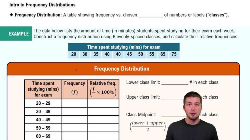
Frequency Distribution
A frequency distribution is a summary of how often each value occurs in a dataset. It organizes data into categories or intervals, showing the number of observations within each category. This foundational concept is crucial for visualizing data patterns and understanding the overall distribution of values.
Recommended video:
Guided course

Intro to Frequency Distributions
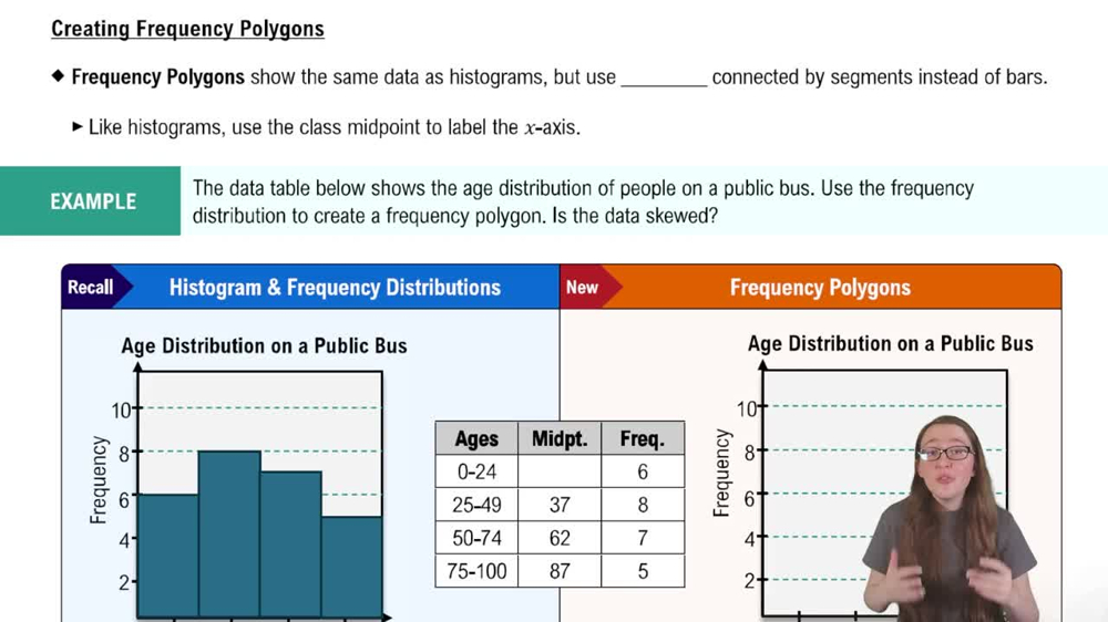
Frequency Polygon
A frequency polygon is a graphical representation of a frequency distribution, created by plotting points for the frequency of each category and connecting them with straight lines. This type of graph helps to visualize the shape of the distribution, making it easier to identify trends, peaks, and potential skewness in the data.
Recommended video:

Creating Frequency Polygons
Skewness
Skewness refers to the asymmetry of a distribution, indicating whether data points are concentrated on one side of the mean. A distribution is positively skewed if it has a long tail on the right, while a negatively skewed distribution has a long tail on the left. Understanding skewness is essential for interpreting the shape of the frequency polygon and assessing the nature of the data.
Recommended video:

Creating Frequency Polygons
Related Videos
Related Practice
Textbook Question
94
views


