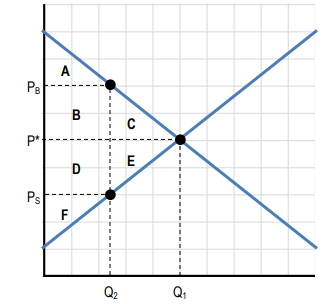
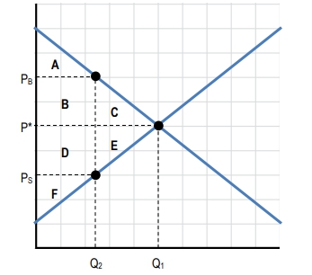
Understanding the impact of taxes on a market involves analyzing shifts in supply or demand curves and calculating the resulting tax revenue. When a per unit tax is imposed, it typically shifts either the supply or demand curve. For example, a tax on sellers shifts the supply curve to the left, reducing the quantity sold in the market. The new equilibrium quantity after the tax, denoted as \(q_t\), is found where the shifted supply curve intersects the original demand curve.
At this new equilibrium, the price buyers pay (\(P_b\)) is higher than the price sellers receive (\(P_s\)) due to the tax. The difference between these two prices represents the per unit tax rate, calculated as:
\[\text{Tax per unit} = P_b - P_s\]The total tax revenue collected by the government is the product of this per unit tax and the quantity sold after the tax is imposed. This can be expressed as:
\[\text{Tax Revenue} = (P_b - P_s) \times q_t\]Graphically, tax revenue is illustrated as the area of a rectangle on the supply and demand diagram. The height of this rectangle corresponds to the per unit tax (the vertical distance between \(P_b\) and \(P_s\)), and the width corresponds to the quantity sold after tax (\(q_t\)). This visual representation helps in understanding how taxes reduce the quantity traded and generate revenue.
For instance, if buyers pay \$10 per unit and sellers receive \$7 per unit after a tax, the per unit tax is \$3. If the quantity sold after tax is 10 units, then the total tax revenue is:
\[3 \times 10 = 30\]Recognizing how to calculate and illustrate tax revenue on supply and demand diagrams is essential for analyzing the economic effects of taxation. This approach not only quantifies government revenue but also highlights the changes in market equilibrium caused by taxes, providing a foundation for deeper exploration of tax incidence and efficiency in markets.