The comparison between the Michaelis-Menten plot and the Lineweaver-Burk plot highlights the advantages of using graphical methods to determine enzyme kinetic variables such as maximum reaction velocity (Vmax) and the Michaelis constant (Km). When enzyme kinetic variables are unknown, these plots can still provide valuable insights into enzyme behavior.
The Michaelis-Menten plot typically displays a rectangular hyperbola, where the y-axis represents the initial reaction velocity and the x-axis represents substrate concentration. In this plot, Vmax is indicated by a horizontal asymptote, while Km is defined as the substrate concentration at which the initial reaction velocity is half of Vmax (Vmax/2). However, when experimental data points are plotted, they may not perfectly align to form the expected curve. Often, only a few data points contribute to the plateau that indicates Vmax, leading to potential inaccuracies in estimating both Vmax and Km.
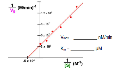
In contrast, the Lineweaver-Burk plot, also known as a double reciprocal plot, presents the reciprocal of the initial reaction velocity on the y-axis and the reciprocal of the substrate concentration on the x-axis. This transformation linearizes the data, allowing all experimental data points to contribute to a line of best fit. The y-intercept of this line corresponds to 1/Vmax, while the x-intercept relates to -1/Km. Because all data points are utilized in determining these intercepts, the Lineweaver-Burk plot provides a more accurate measurement of both Vmax and Km.
In summary, while both plots serve to analyze enzyme kinetics, the Lineweaver-Burk plot offers a more reliable method for determining key kinetic parameters due to its ability to incorporate all experimental data points into a linear representation. This results in enhanced accuracy for both Vmax and Km, making it a preferred choice in enzyme kinetics studies.